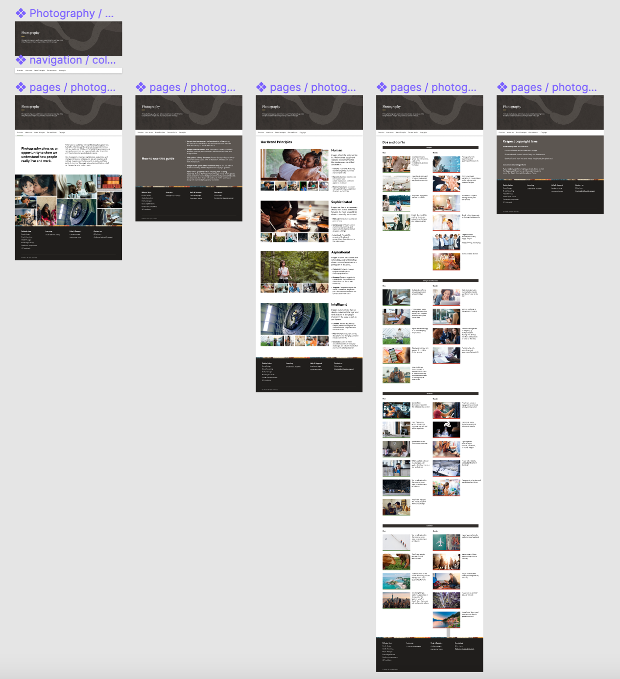
Oracle Brand Photography Style Guide
Category: Layout | UIUX |Style Guide
Director: Takashi Kusui
My Role: Lead designer, page production
Tasks: Updates new styleguide layout, new storytelling and browsing experience, production and site developing.
Overview:
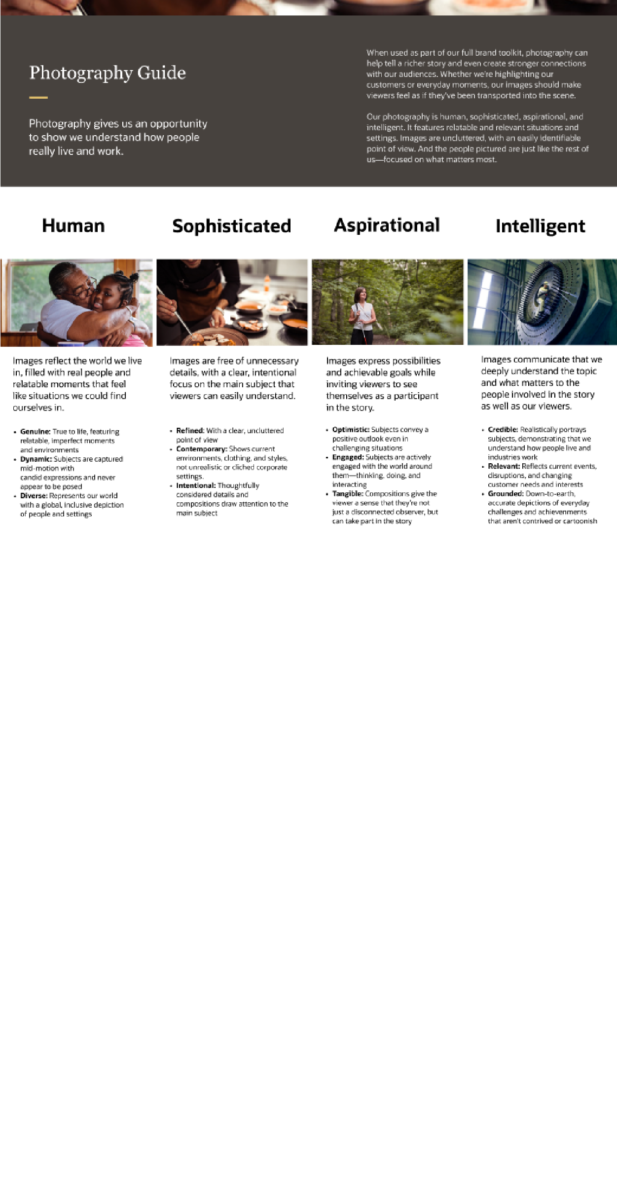
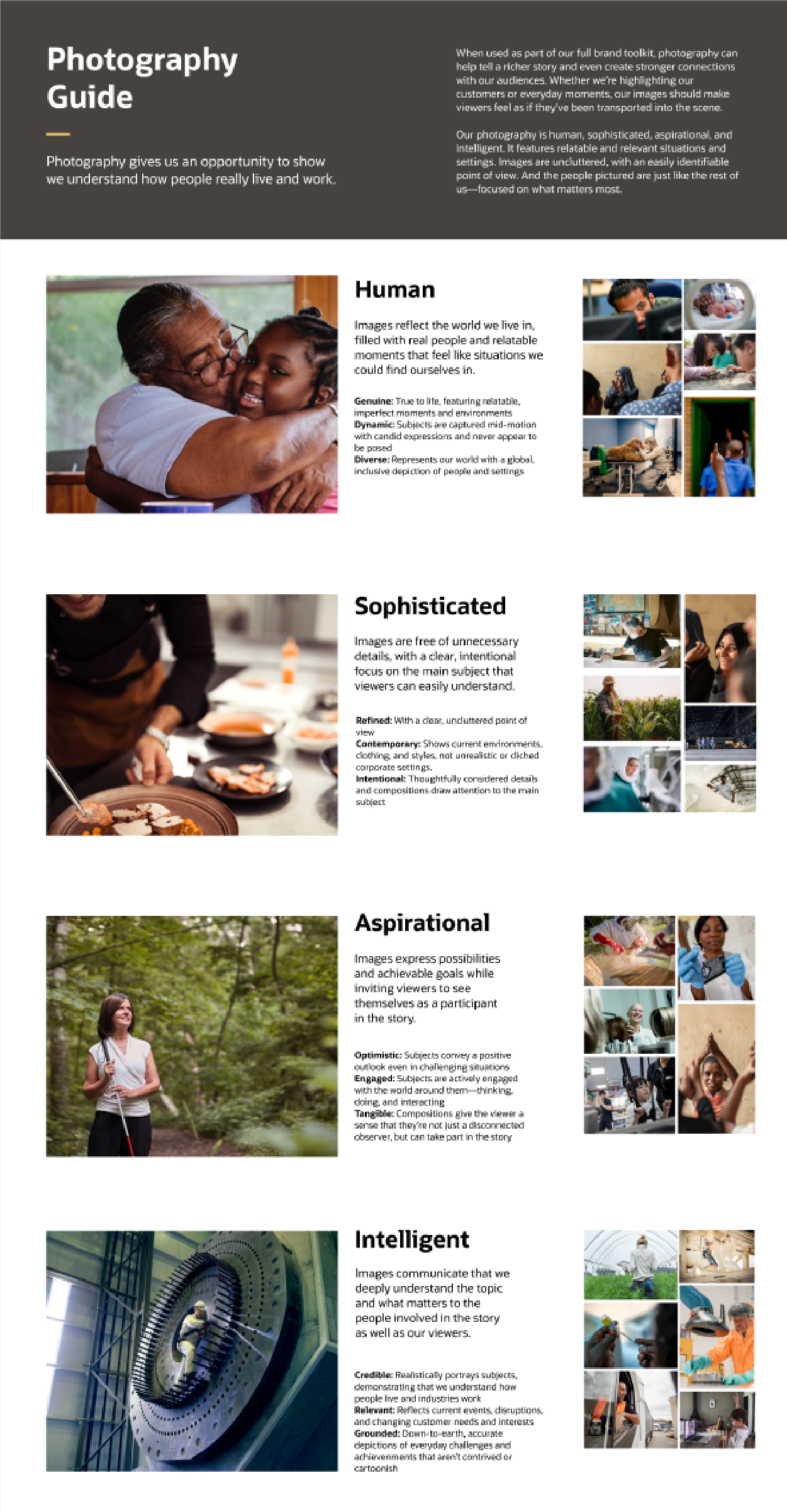
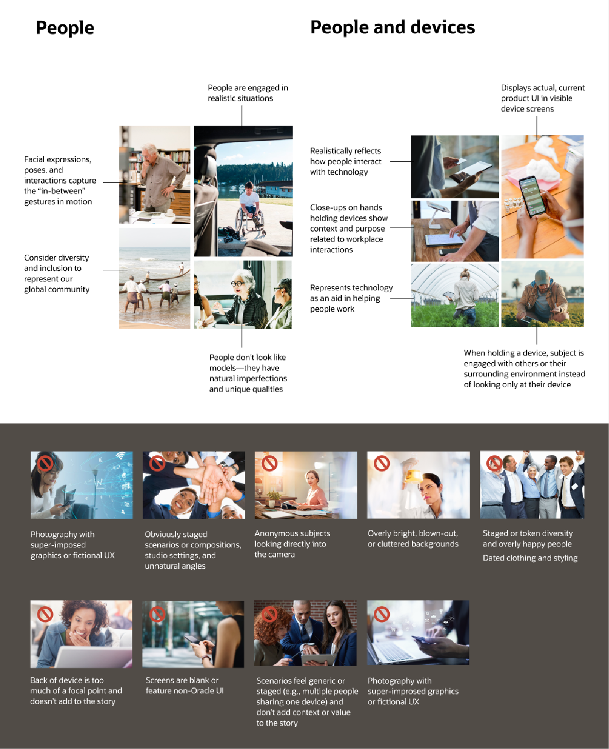
Along with all other brand asset updating and developing, Oracle Brand Photography Styleguide is outdated. When used as part of Oracle full brand tookkit, photography can help tell a richer story and even create stronger connections with audiences. It's highlighting customers or everyday moments, the images should make viewers feel as if they've been transported into the scene.
Oracle design VP directed the project and pushed the new style guide forward. I took the project, followed the Redwood design principles, explored the layouts and storytelling flow for the new photo guide. The team is also applying the new layout I designed for Oracle Design System Style Guide pages on Oracle Brand Site. I worked with the developer, quickly set up the new style guide for Oracle Brand through Figma.
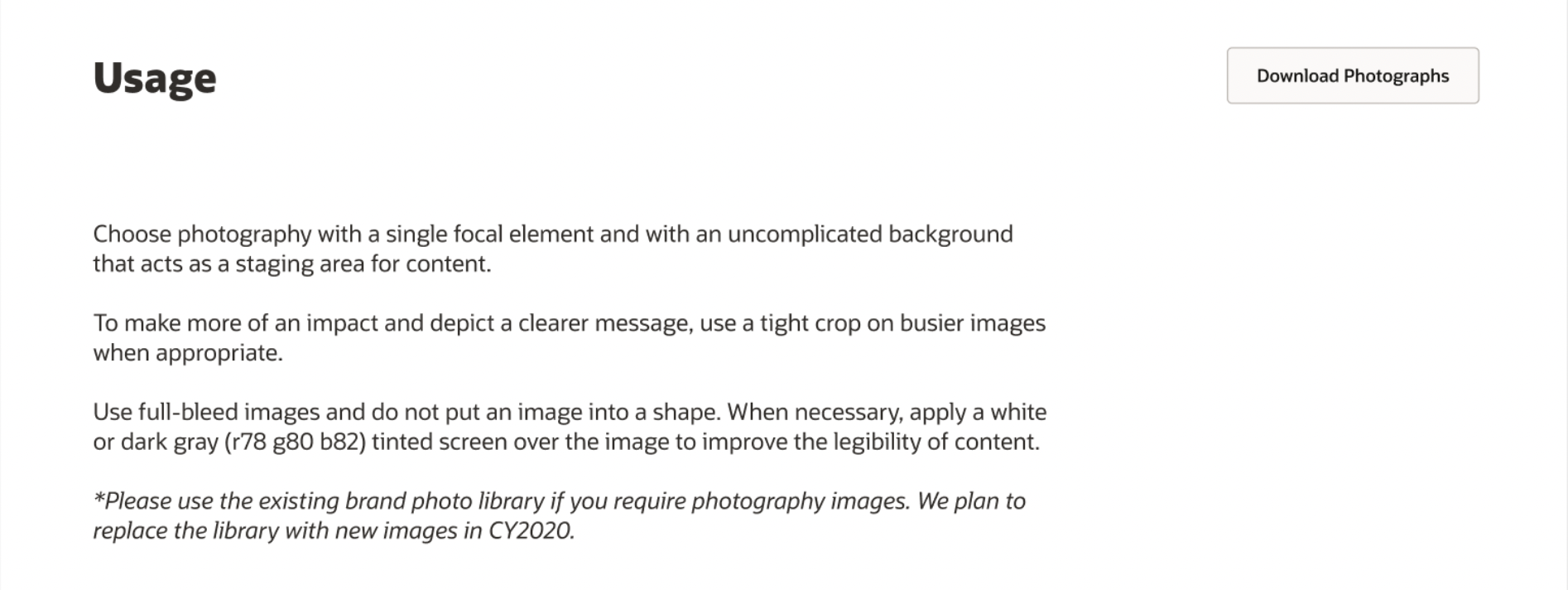
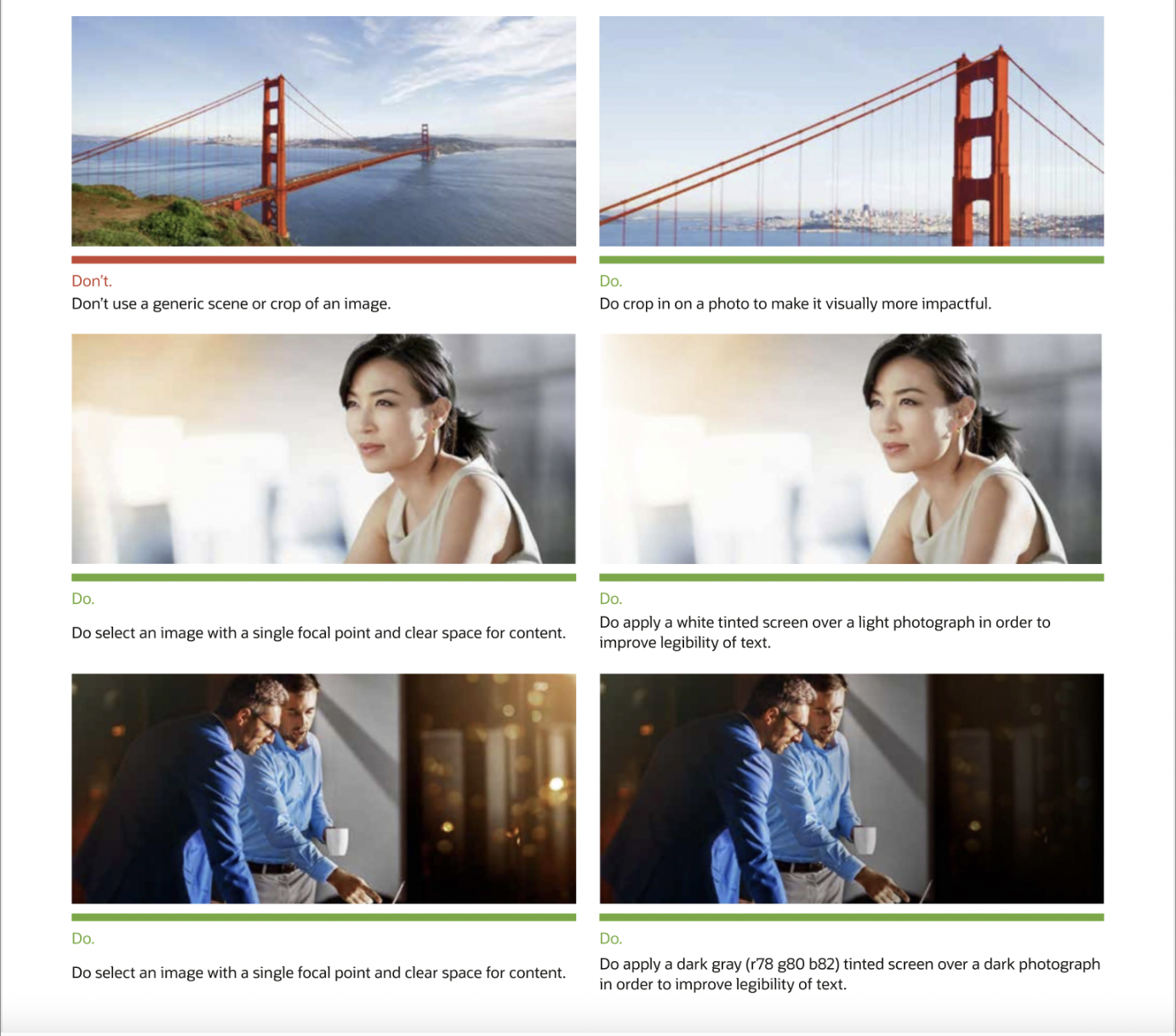
Before rebrand
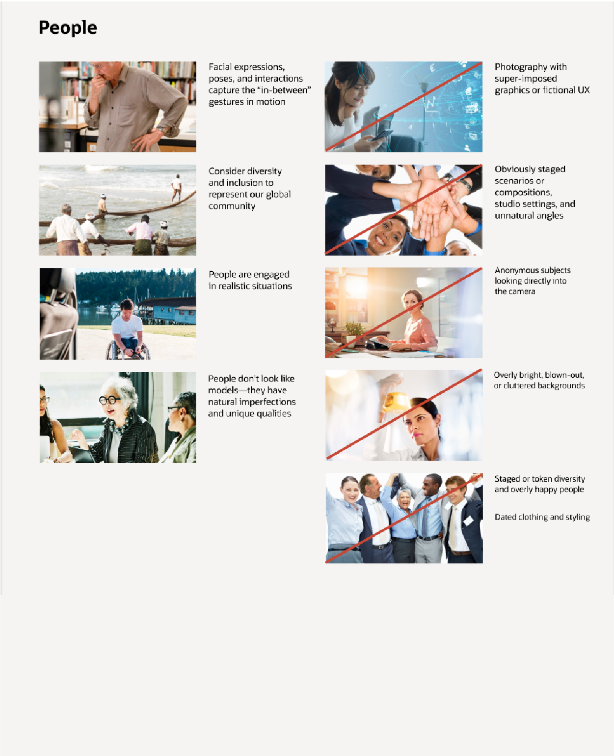
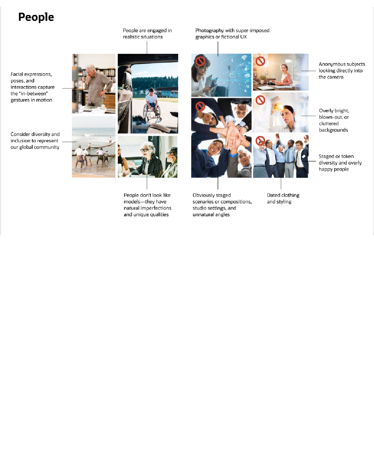
Before Redwood new brand style, Oracle likes all other big corp— using general stock images as brand photo style.
Page explorations
The explorations of the layout design, the main points are:
- Translate documents into new brand website;
- Find out new banner style for all brand assets;
- Better storytelling with Oracle's new image heavy designs;
- Better reading experience from brand page.
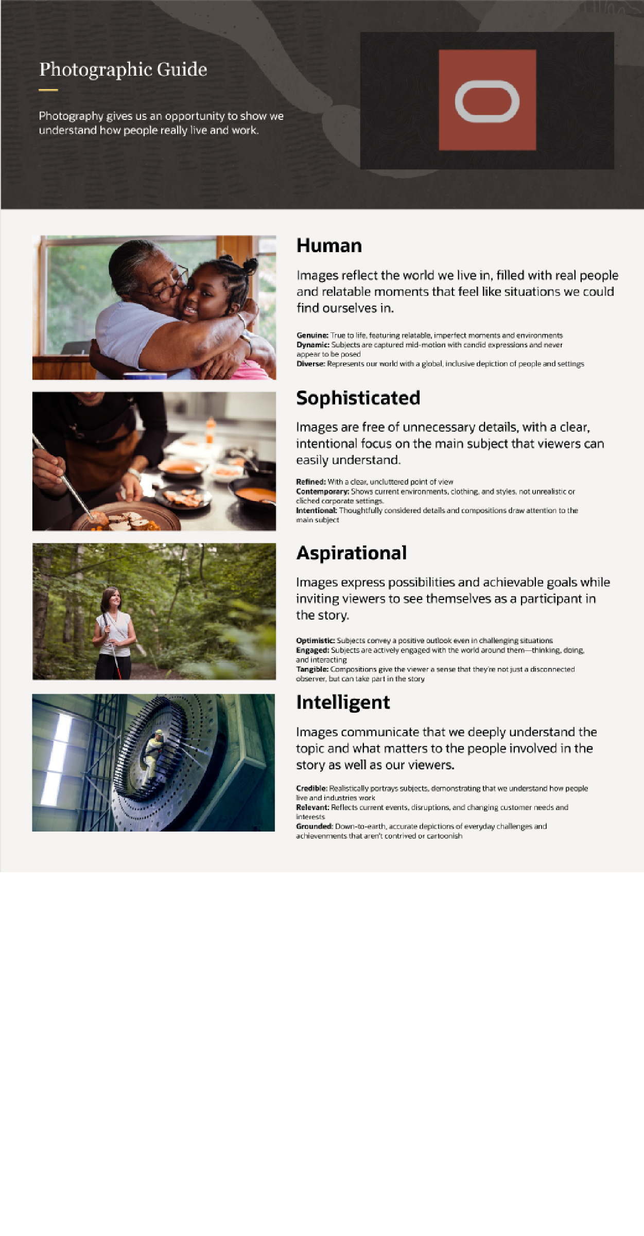
Final Design
